
ShelterBox began over 20 years ago with our iconic green ShelterBoxes. Today, we do much more.
We listen to what communities need. We support by giving the right emergency shelter items. And we share our expertise, helping people build, repair or return home.
It is important to us that our brand story reflects who we are today in 2023, and brings our supporters into our story. As such this year we have been refreshing our branding to help express who we are and what we do. Keep reading to learn more.
No one without shelter after disaster
This seems such a simple premise doesn’t it? That no one should have to live without shelter after being forced from their home. This could be through disaster, conflict or as a result of the climate crisis.
Simple as it is, this message is at the heart of ShelterBox – it is the reason why we exist. We believe that no one should be without shelter after disaster, but sadly it is a reality for over 100 million people in the world. As such through specialising in shelter aid, we aim to make a difference in the lives of people. And by working with partners and listening to those we support, we make sure we’re bringing the right aid at the right time.
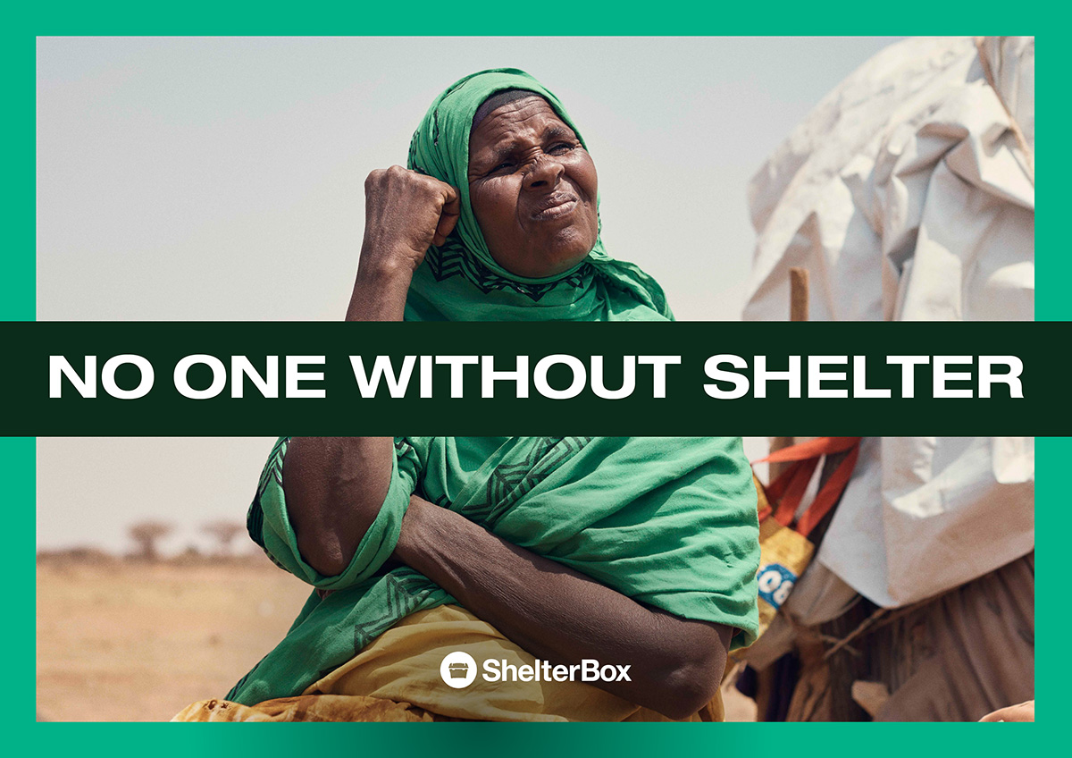
Being at the heart of what we do, no one without shelter after disaster is also at the heart of our brand message. You’ll see it in documents, media content and digital materials.
Foundations for Life
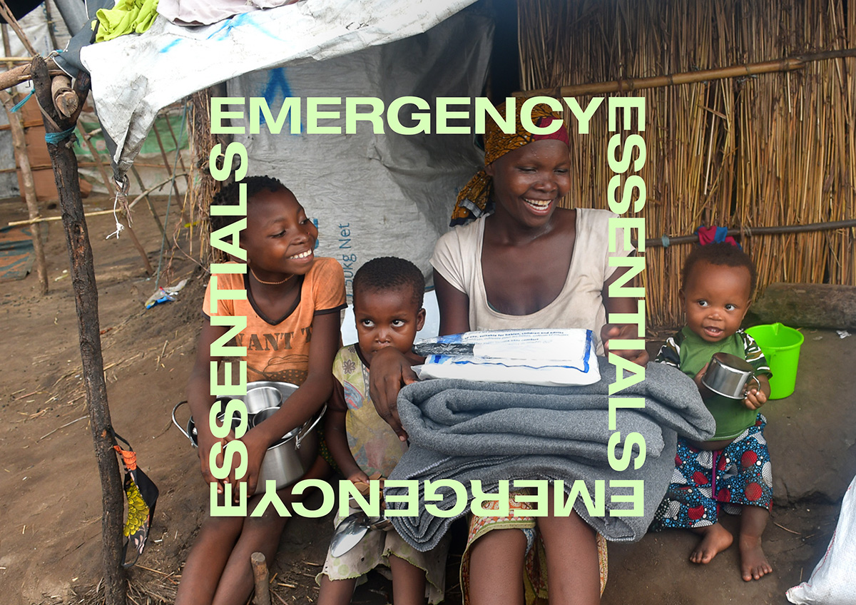
In our Theory of Change we say that shelter is a foundation for life, and this is what we promise to deliver.
Shelter is so much more than a place to escape the elements. It provides security, privacy, dignity, comfort, and an opportunity for families to spend time together. It helps people who have lost everything restart livelihoods, and children continue their studies.
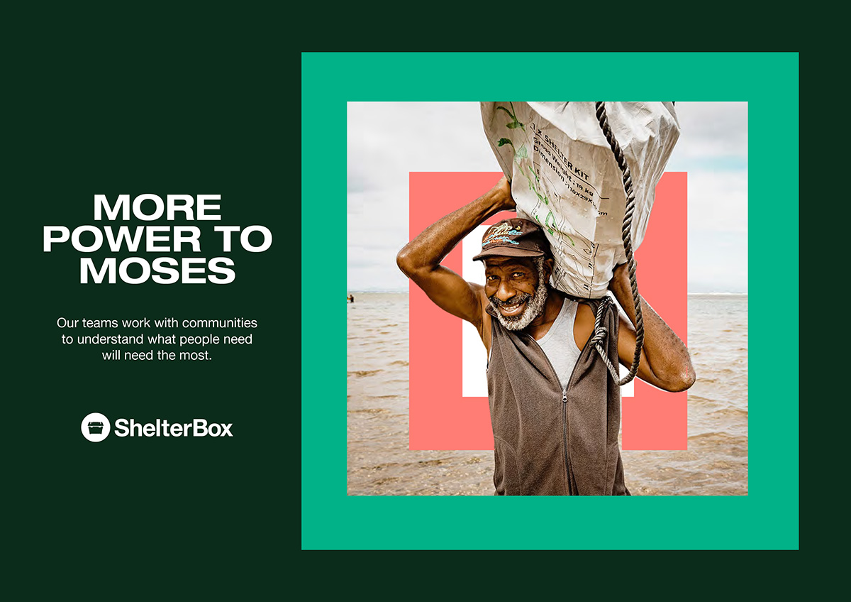
As such this idea of foundations for life is something you will see reflected in our new brand materials. One example of this is through the use of foundation blocks. These are flexible design elements that help add interest and variety to our communications. We can use them to frame and highlight our messages.
One place you can see these foundation blocks in use is with our photography. The principles behind the photos we use remain the same. We aim tell a truthful narrative of our work and the people we support, and to help tell stories in a powerful way. The use of the foundation block designs with our photographs aims to highlight the people in our photos, and their stories. You may have already seen these as we have begun using them in some of our print and digital publicity. They will appear more often as we refresh our publicity materials to reflect our new branding.
Sharing our message
When people think of well-known brands, certain things may pop into mind. One thing that many brands have in common is a specific logo, colours and fonts that they might use.
Our logo, and many of our core brand elements remain the same – an important part of our identity when sharing our message.
However, one thing that we had received feedback on is that the colours and fonts we have used in the past meant that our messaging was not always as clear as it could be. We want as many people to be able to access our publicity materials and hear our messaging as possible. As such, during the brand refresh we have refined the colours and fonts we have used. Our brand colours have all been tested for accessibility and score highly, which should make it easier for supporters to read our content. We have also chosen a font that is bold and distinctive to ensure our messaging is clear.
One colour that you’ll notice a lot in our communications is green! This is inspired by the green boxes that we first used to ship aid. For our urgent appeals red will be a more dominant colour, highlighting the need for support.
We are ShelterBox
As part of our brand refresh we’re thrilled to be able to share with you our new ‘what we do’ film.
Titled ‘We are ShelterBox’, we wanted this film to be a clear expression of why we exist, what we do and how we do it. We also wanted it to capture our new visual branding. Watch it below!
You’ll see our new branding appear more and more in coming weeks. We hope you’ll agree that it helps share our message more clearly than ever, and brings a focus on the importance of shelter.